Happy Delivery, 2025
Context and Objectives
Happy’s online ordering service already has a strong user base and a functioning product. However, its current UX does not fully unlock the platform’s commercial potential.
The goal of this consultation was to identify growth opportunities that could positively impact key product metrics.
A UX audit and analysis of user journeys showed that achieving a fundamentally better ordering experience requires rethinking the core process of browsing and selecting dishes. The main menu and its structure form the user’s first and most important impression of the product. In the original version, however, they were functionally and hierarchically outdated and contained several basic UX issues.The proposed redesign is grounded in a deep analysis of existing solutions, user behavior, and the broader product context.
Summary of Key UX Issues
The current online ordering experience contains several usability problems affecting efficiency, clarity, and overall user satisfaction. The main issues include:
Cart and Search
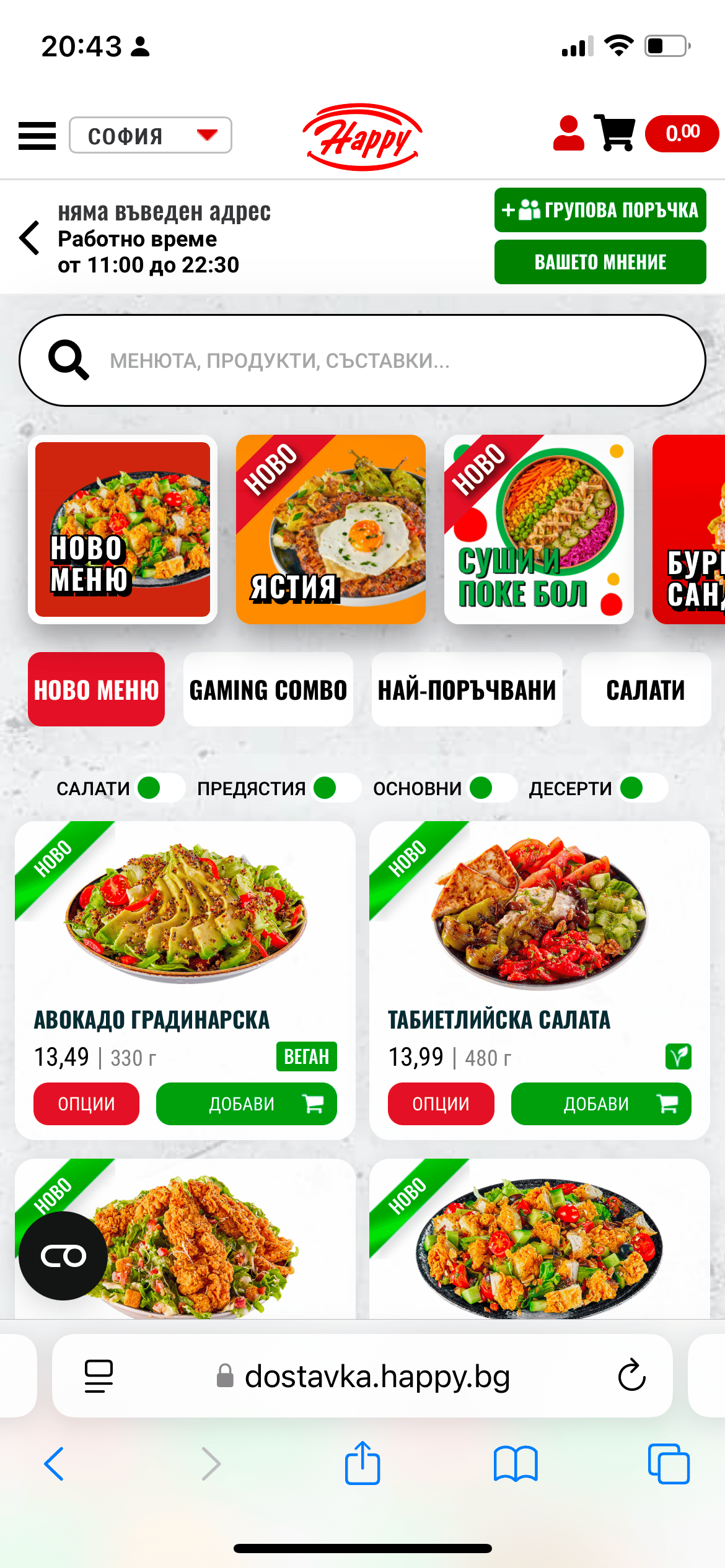
The cart and price are not semantically grouped and are placed too close to the profile area. They are also positioned outside the comfortable reach zone, making one-handed interaction less ergonomic.
Navigation and Hierarchy
The top-level navigation is inconsistent and contains duplicated elements. The hierarchy is not immediately clear. The information architecture was reworked while preserving the original conceptual logic behind the menu structure.
Visual Hierarchy and Presentation
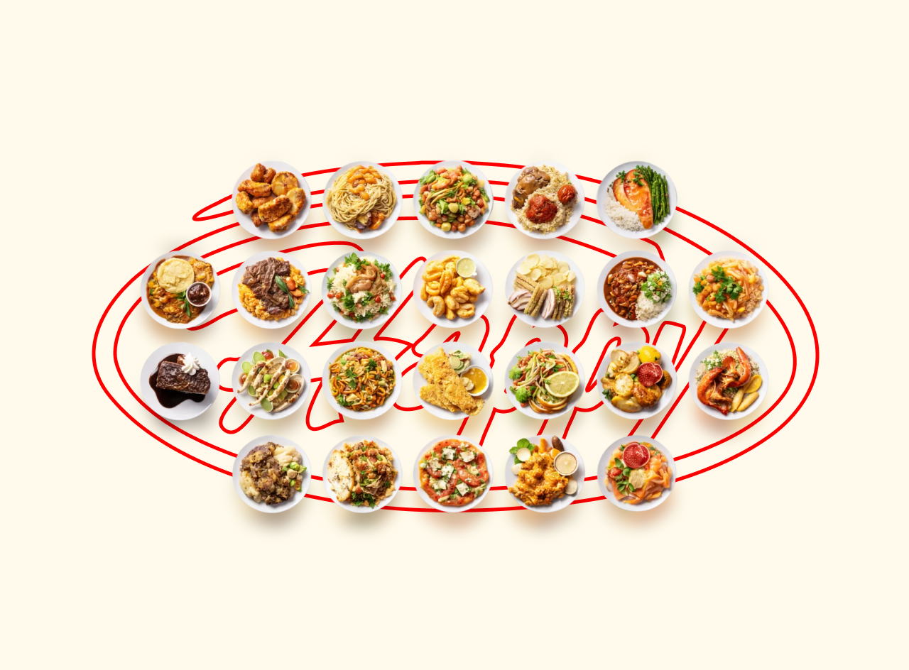
The menu header dominates the interface and distracts from the primary content. The absence of a clear color hierarchy creates visual noise. Dish images do not effectively showcase the food, and the “New” label appears overly intrusive.
Interaction and Usability
Buttons and toggles are too small and do not meet modern touch interaction standards. The interaction logic of dish cards breaks the browsing flow — tapping anywhere opens the dish details, forcing users to leave the menu context.
These issues reveal significant opportunities for improvement that can increase user satisfaction, raise the average order value, and improve retention. Addressing them through interface refinement, menu restructuring, and optimization of the user flow can create a more cohesive and enjoyable ordering experience.
UX / UI Proposal
This proposal introduces a set of UX and UI improvements designed to significantly enhance usability, reduce friction, and encourage repeat usage.
Action Optimization
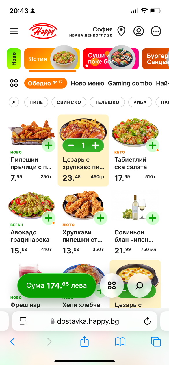
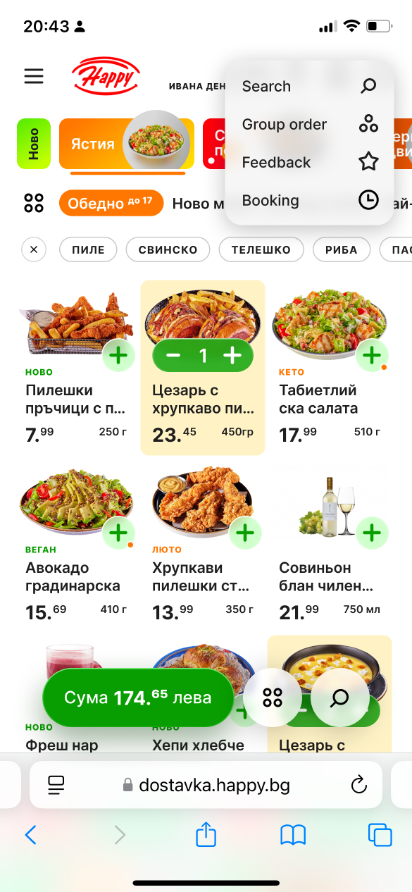
Address input, account management, site search, bill splitting, feedback, and reservations are consolidated into a single, convenient action bar placed outside the main menu browsing flow.
Improved Navigation and Selection
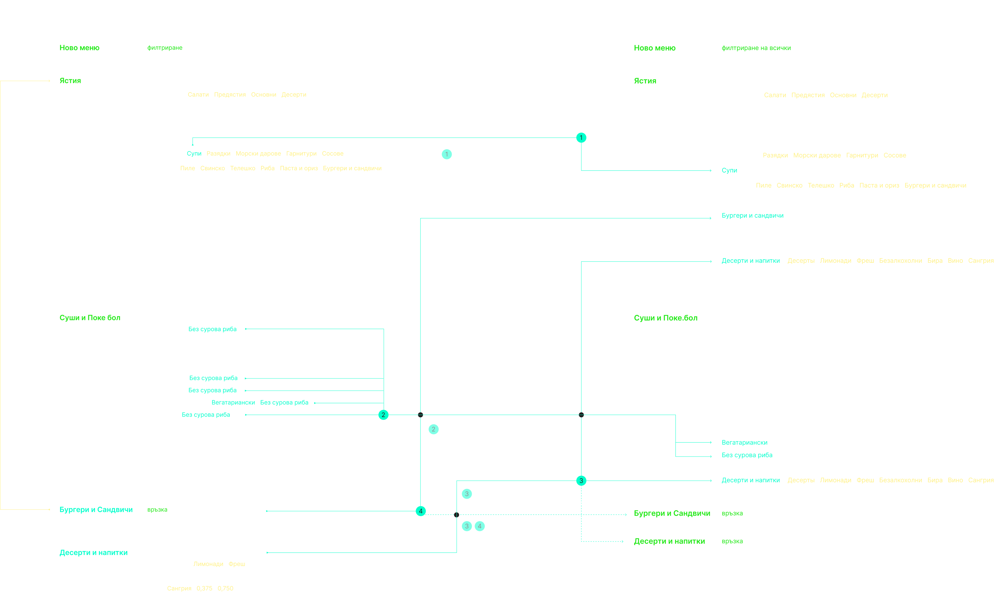
Banners, links, and filters have been redesigned for better readability while maintaining a consistent visual language.The menu selection mechanism now ensures that the currently selected category always appears first, while the core and Asian menus remain persistently accessible.
Optimized Structure
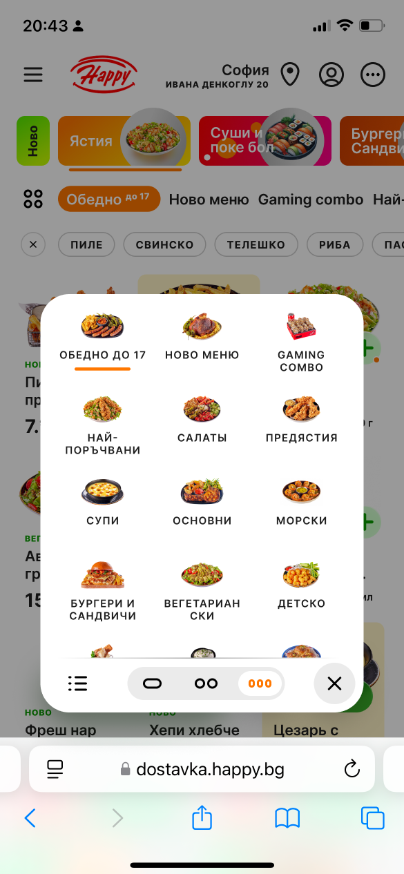
Each menu section and its filters support both horizontal scrolling and a vertical modal view for quick selection. Search remains continuously available within a comfortable reach zone.
Dish Card Design
The card structure has been redesigned for better readability, easier add-to-cart interaction, and more intuitive quantity selection — inspired by best practices from food-delivery platforms such as Glovo.The new layout allows up to eight items per screen instead of the current 2.5, significantly improving menu browsing efficiency.
Seamless Checkout Flow
When a dish is added to the cart, a checkout button with the final order total appears in the most thumb-friendly area of the screen. This placement improves clarity and has a positive impact on conversion.
Clear Labels and Customization
All dishes include clear informational labels, and submenu selection is implemented via a convenient modal interface that allows users to customize both the visibility and quantity of items displayed.
Дефолтное состояние
Фильтры
Мета сценарии
Interactive prototype
Conclusion
Despite the work completed and the prepared recommendations, it was not possible to establish direct communication with the business owners or the product team responsible for Happy’s delivery platform. To some extent, this reflects the characteristics of the local market, where proactive external UX consulting is not always integrated into product development processes.
Nevertheless, this project became a valuable UX exercise and research practice. It provided an opportunity to analyze user behavior in the food-ordering domain more deeply and to formulate a set of solutions based on modern UX principles.Working on this case was both engaging and professionally rewarding, contributing to the continued development of my expertise in service design and e-commerce UX.
© Alexander Zykow, 2026
Before
After
Next case Trade Station →


Happy Delivery, 2025
Context and Objectives
Happy’s online ordering service already has a strong user base and a functioning product. However, its current UX does not fully unlock the platform’s commercial potential.
The goal of this consultation was to identify growth opportunities that could positively impact key product metrics.
A UX audit and analysis of user journeys showed that achieving a fundamentally better ordering experience requires rethinking the core process of browsing and selecting dishes. The main menu and its structure form the user’s first and most important impression of the product. In the original version, however, they were functionally and hierarchically outdated and contained several basic UX issues.The proposed redesign is grounded in a deep analysis of existing solutions, user behavior, and the broader product context.
Summary of Key UX Issues
The current online ordering experience contains several usability problems affecting efficiency, clarity, and overall user satisfaction. The main issues include:
Cart and Search
The cart and price are not semantically grouped and are placed too close to the profile area. They are also positioned outside the comfortable reach zone, making one-handed interaction less ergonomic.
Navigation and Hierarchy
The top-level navigation is inconsistent and contains duplicated elements. The hierarchy is not immediately clear. The information architecture was reworked while preserving the original conceptual logic behind the menu structure.
Visual Hierarchy and Presentation
The menu header dominates the interface and distracts from the primary content. The absence of a clear color hierarchy creates visual noise. Dish images do not effectively showcase the food, and the “New” label appears overly intrusive.
Interaction and Usability
Buttons and toggles are too small and do not meet modern touch interaction standards. The interaction logic of dish cards breaks the browsing flow — tapping anywhere opens the dish details, forcing users to leave the menu context.
These issues reveal significant opportunities for improvement that can increase user satisfaction, raise the average order value, and improve retention. Addressing them through interface refinement, menu restructuring, and optimization of the user flow can create a more cohesive and enjoyable ordering experience.
UX / UI Proposal
This proposal introduces a set of UX and UI improvements designed to significantly enhance usability, reduce friction, and encourage repeat usage.
Action Optimization
Address input, account management, site search, bill splitting, feedback, and reservations are consolidated into a single, convenient action bar placed outside the main menu browsing flow.
Improved Navigation and Selection
Banners, links, and filters have been redesigned for better readability while maintaining a consistent visual language.The menu selection mechanism now ensures that the currently selected category always appears first, while the core and Asian menus remain persistently accessible.
Optimized Structure
Each menu section and its filters support both horizontal scrolling and a vertical modal view for quick selection. Search remains continuously available within a comfortable reach zone.
Dish Card Design
The card structure has been redesigned for better readability, easier add-to-cart interaction, and more intuitive quantity selection — inspired by best practices from food-delivery platforms such as Glovo.The new layout allows up to eight items per screen instead of the current 2.5, significantly improving menu browsing efficiency.
Seamless Checkout Flow
When a dish is added to the cart, a checkout button with the final order total appears in the most thumb-friendly area of the screen. This placement improves clarity and has a positive impact on conversion.
Clear Labels and Customization
All dishes include clear informational labels, and submenu selection is implemented via a convenient modal interface that allows users to customize both the visibility and quantity of items displayed.
Default state
Filters
Meta-scenarios
Interactive prototype
Conclusion
Despite the work completed and the prepared recommendations, it was not possible to establish direct communication with the business owners or the product team responsible for Happy’s delivery platform. To some extent, this reflects the characteristics of the local market, where proactive external UX consulting is not always integrated into product development processes.
Nevertheless, this project became a valuable UX exercise and research practice. It provided an opportunity to analyze user behavior in the food-ordering domain more deeply and to formulate a set of solutions based on modern UX principles.Working on this case was both engaging and professionally rewarding, contributing to the continued development of my expertise in service design and e-commerce UX.
© Alexander Zykow, 2026
Before
After
Next case Trade Station →