

Apple Bento Grid as a System of Attention Management
Context and Hypothesis
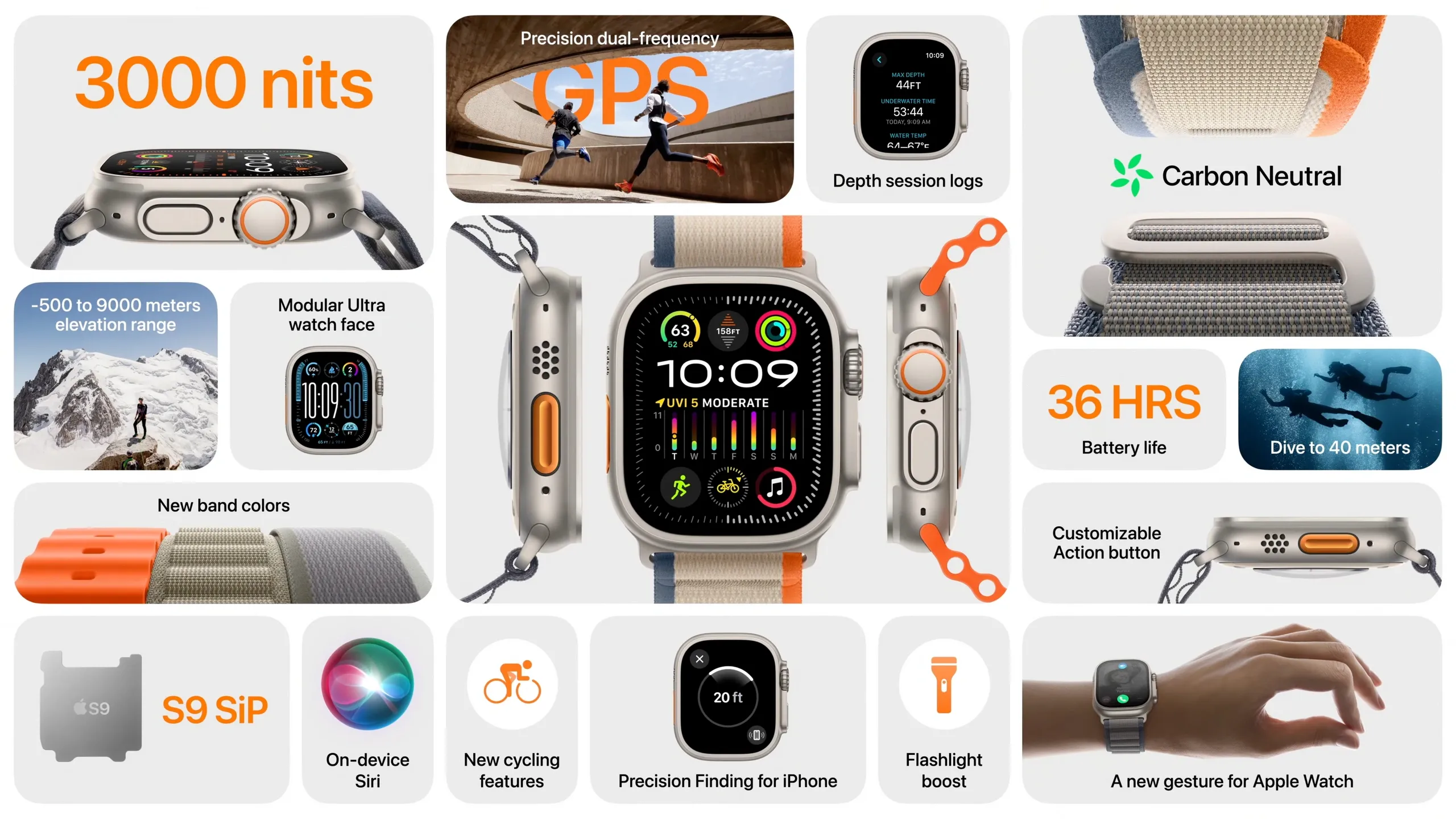
For several years now, Apple has been concluding product presentations with a Bento-style grid of features and benefits — concentrating the audience’s attention within a single visual frame.
My Hypothesis
The Apple Bento Grid is not just a visual style. It is a carefully researched attention-management tool — likely shaped by extensive experimentation within one of the world’s most research-driven companies.
This pattern allows Apple to:
- present a large amount of value on a single screen
- communicate key offers without requiring mandatory scrolling
- create a controlled hierarchy of attention
- maintain engagement through a playful, modular composition
In essence, it works like a product showcase: within seconds, the user understands what matters most and can choose where to dive deeper.
My assumption is that this approach is particularly well suited for next-generation landing pages.
Origins of the Bento Approach
The word bento comes from the Japanese lunch box divided into compartments — different “flavors” within a single container.
In interface design, this idea evolved into a modular card layout, where tiles of different sizes coexist within a unified showcase area.
The key idea is not the grid itself, but the hierarchy of value within the grid.
Users rarely read pages top-to-bottom.They scan, compare, and select an entry point.
The Bento approach simply accepts this behavior as a given and designs around it.
What Exactly I Researched
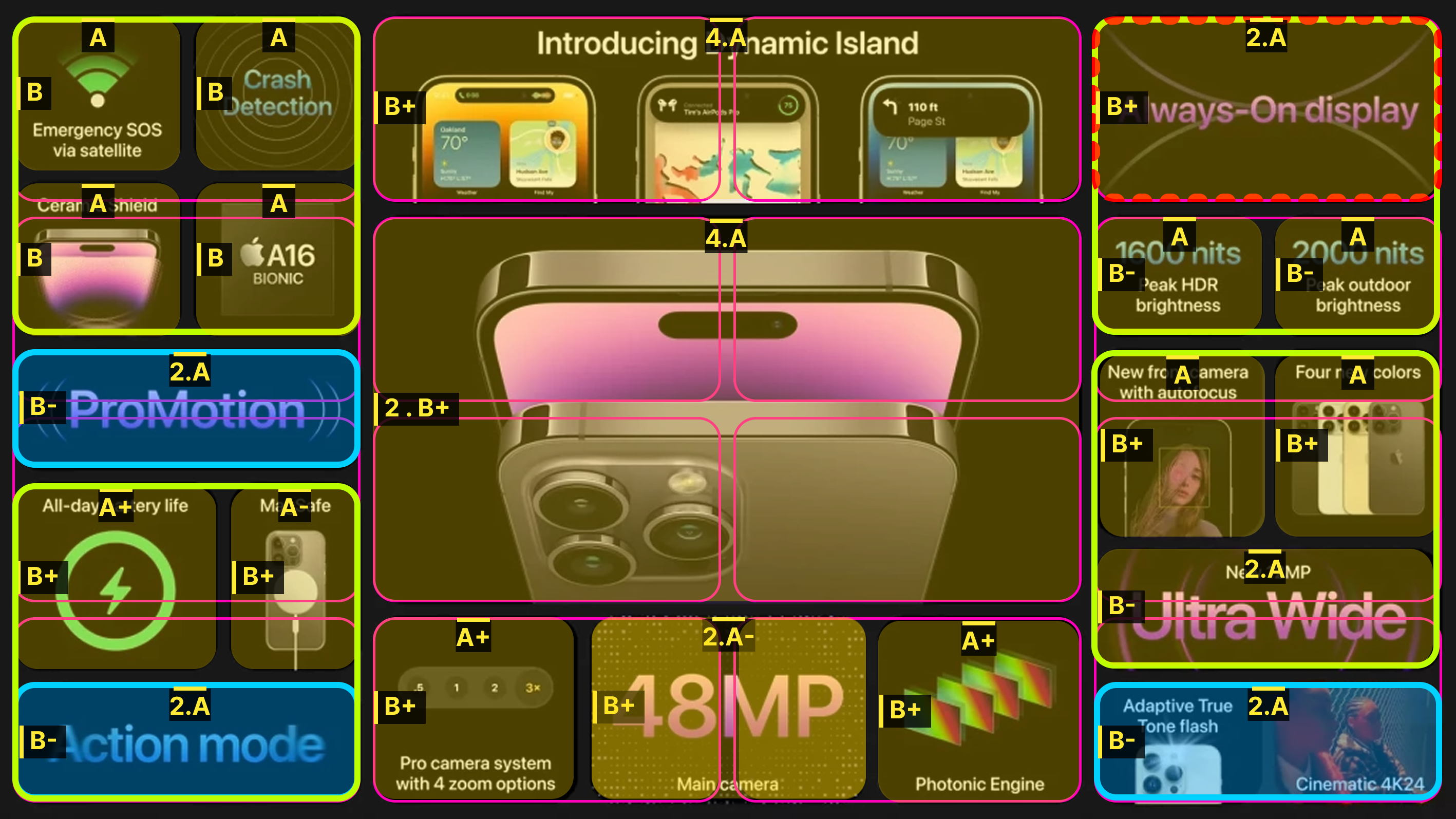
In my personal study, I analyzed Bento-like compositions across several levels:
- macro grid structure and proportions
- internal sub-grids within cards
- distribution of primary / secondary / tertiary elements
- the role of scale, contrast, and typography
- responsive layout scenarios
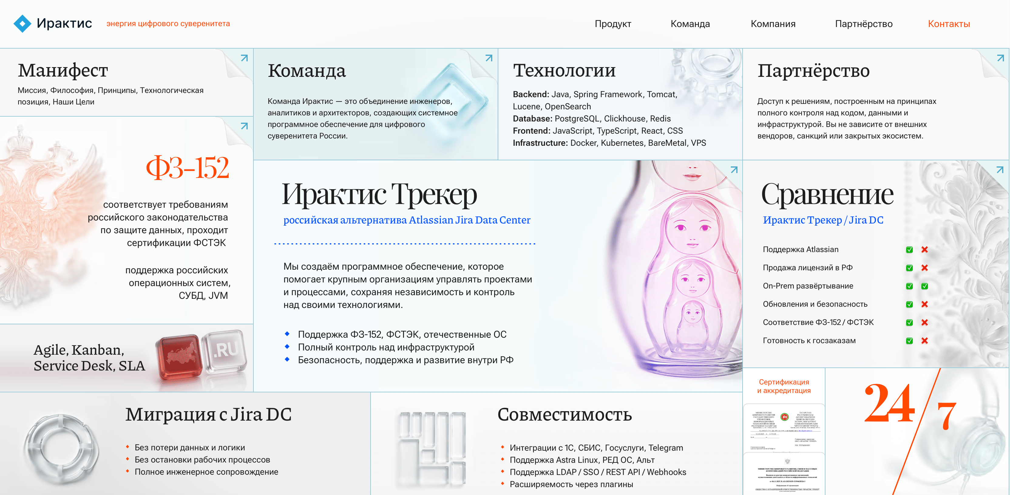
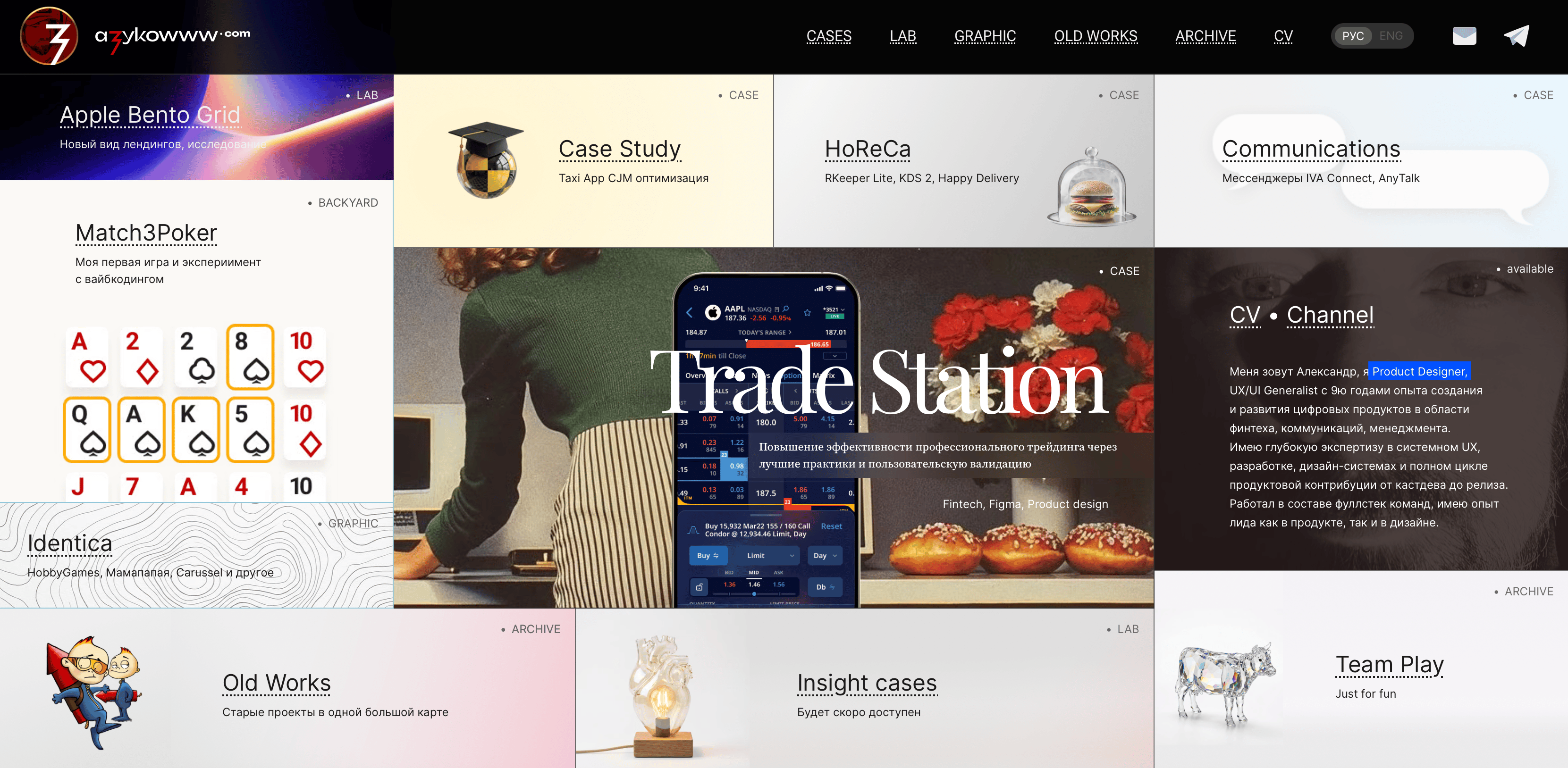
Afterward, I tested the approach in practice:
- within a visually dense product design
- in a client web proposal for Iractis Tracker
- on my own portfolio website azykowww.com
Full statistical data is not yet available, but early signals are promising:higher engagement with cards and faster comprehension of the page’s key message.
How Bento Manages Attention
1. Hierarchy: Primary → Secondary → Tertiary
Bento is not about “scattering cards.”It is about designing a path for the eye.
- Primary1–2 dominant elements.Large blocks or strong typographic anchors that communicate the core message of the section.
- Secondary3–6 medium-scale cards.These reveal key scenarios and product advantages.They function as alternative entry points.
- TertiarySmall informational blocks containing details and proof points.
They don’t compete for attention — they reward curiosity.
This structure creates the feeling of high value density without overwhelming the first glance.
2. Scanning and the First Screen
Users tend to scan rather than read.
One of the most stable patterns is the F-shaped scanning behavior: attention concentrates at the top and left side of the screen before moving downward.
Bento fits naturally into this behavior:
- large blocks anchor attention
- varying scales create natural pause points
- cards function as independent product entry points
At the same time, designers must avoid banner blindness.If a card visually resembles an advertisement, some users may simply ignore it.
Fitts’s Law and Hick’s Law in the Context of Bento
Fitts’s LawThe larger and closer a target is, the faster users can interact with it.Primary cards effectively become accelerated CTA zones.
Hick’s LawThe more alternatives presented, the longer decision-making takes.Bento only works when the hierarchy is honest.If every card “shouts” equally, the pattern collapses.
Visual Levers of Attention
Bento can be viewed as an attention control panel:
Scale sets priorityContrast accelerates discoveryColor marks importance (used sparingly)Typography shapes micro-information architectureGrouping reduces chaos in dense layouts
This aligns well with visual saliency models, Gestalt principles, and classical HCI laws.
Where Bento Works Especially Well
- Multi-feature products with complex value propositions
- Segmented audiences
- Landing pages with high value density
- Products where a premium perception matters
Why It Works
High value, low patienceUsers grasp the overall meaning quickly and choose the angle that interests them.
Multiple offers without “the wall of text”Cards provide structure and visual order.
Multiple entry pointsOne page can serve different user motivations.
Visual confidenceWith strong typography and composition, Bento naturally feels premium.
Limitations and Risks
Bento is not a silver bullet.
Choice overloadToo many equally weighted cards increase decision time.
Mobile compromiseOn mobile devices the mosaic often collapses into a vertical stack. Priorities must be restructured.
Content demandsShort, clear copy and strong visuals are essential.Otherwise visual noise emerges.
Performance risksHeavy animations and video can negatively impact Core Web Vitals.


SEO, Accessibility, and Performance
The most common mistake is implementing Bento as a single image.
This creates several issues:
- poor accessibility (no semantic content)
- weak SEO (search engines cannot interpret meaning)
- slower loading
- unstable rendering
Performance directly affects conversion.Even small improvements in speed metrics often correlate with higher engagement.
A well-designed Bento layout is semantic markup with a visual layer, not a static poster.
Practical Implementation
I am currently developing the Bento approach as a template system for Figma Sites, providing:
- adaptive layout rules
- flexible card variations
- rapid prototyping
- experimental landing page pilots
Conclusion
For me, the Bento Grid is fundamentally a system for managing attention.
It allows designers to:
- package complex products clearly
- control visual hierarchy
- give users freedom to explore
- present products in a confident, modern way
I continue expanding a library of Bento templates and applying these patterns to real products.
Collaboration Proposal
I approach Bento not as a fashionable visual style, but as a structured design system built around:
- clear value hierarchy
- pilot implementations with measurable metrics (CTR, scroll depth, conversion)
- heatmaps and hypotheses instead of subjective taste
- scalable templates for landing pages and partner sites
If this approach resonates with you, I’m open to pilot projects and collaborative experiments.
Contact me
© Alexander Zykow, 2026
Next Case
Trade Station →


Apple Bento Grid as a System of Attention Management
Context and Hypothesis
For several years now, Apple has been concluding product presentations with a Bento-style grid of features and benefits — concentrating the audience’s attention within a single visual frame.
My Hypothesis
The Apple Bento Grid is not just a visual style. It is a carefully researched attention-management tool — likely shaped by extensive experimentation within one of the world’s most research-driven companies.
This pattern allows Apple to:
- present a large amount of value on a single screen
- communicate key offers without requiring mandatory scrolling
- create a controlled hierarchy of attention
- maintain engagement through a playful, modular composition
In essence, it works like a product showcase: within seconds, the user understands what matters most and can choose where to dive deeper.
My assumption is that this approach is particularly well suited for next-generation landing pages.
Origins of the Bento Approach
The word bento comes from the Japanese lunch box divided into compartments — different “flavors” within a single container.
In interface design, this idea evolved into a modular card layout, where tiles of different sizes coexist within a unified showcase area.
The key idea is not the grid itself, but the hierarchy of value within the grid.
Users rarely read pages top-to-bottom.They scan, compare, and select an entry point.
The Bento approach simply accepts this behavior as a given and designs around it.
What Exactly I Researched
In my personal study, I analyzed Bento-like compositions across several levels:
- macro grid structure and proportions
- internal sub-grids within cards
- distribution of primary / secondary / tertiary elements
- the role of scale, contrast, and typography
- responsive layout scenarios
Afterward, I tested the approach in practice:
- within a visually dense product design
- in a client web proposal for Iractis Tracker
- on my own portfolio website azykowww.com
Full statistical data is not yet available, but early signals are promising:higher engagement with cards and faster comprehension of the page’s key message.
How Bento Manages Attention
1. Hierarchy: Primary → Secondary → Tertiary
Bento is not about “scattering cards.”It is about designing a path for the eye.
- Primary1–2 dominant elements.Large blocks or strong typographic anchors that communicate the core message of the section.
- Secondary3–6 medium-scale cards.These reveal key scenarios and product advantages.They function as alternative entry points.
- TertiarySmall informational blocks containing details and proof points.
They don’t compete for attention — they reward curiosity.
This structure creates the feeling of high value density without overwhelming the first glance.
2. Scanning and the First Screen
Users tend to scan rather than read.
One of the most stable patterns is the F-shaped scanning behavior: attention concentrates at the top and left side of the screen before moving downward.
Bento fits naturally into this behavior:
- large blocks anchor attention
- varying scales create natural pause points
- cards function as independent product entry points
At the same time, designers must avoid banner blindness.If a card visually resembles an advertisement, some users may simply ignore it.
Fitts’s Law and Hick’s Law in the Context of Bento
Fitts’s LawThe larger and closer a target is, the faster users can interact with it.Primary cards effectively become accelerated CTA zones.
Hick’s LawThe more alternatives presented, the longer decision-making takes.Bento only works when the hierarchy is honest.If every card “shouts” equally, the pattern collapses.
Visual Levers of Attention
Bento can be viewed as an attention control panel:
Scale sets priorityContrast accelerates discoveryColor marks importance (used sparingly)Typography shapes micro-information architectureGrouping reduces chaos in dense layouts
This aligns well with visual saliency models, Gestalt principles, and classical HCI laws.
Where Bento Works Especially Well
- Multi-feature products with complex value propositions
- Segmented audiences
- Landing pages with high value density
- Products where a premium perception matters
Why It Works
High value, low patienceUsers grasp the overall meaning quickly and choose the angle that interests them.
Multiple offers without “the wall of text”Cards provide structure and visual order.
Multiple entry pointsOne page can serve different user motivations.
Visual confidenceWith strong typography and composition, Bento naturally feels premium.
Limitations and Risks
Bento is not a silver bullet.
Choice overloadToo many equally weighted cards increase decision time.
Mobile compromiseOn mobile devices the mosaic often collapses into a vertical stack. Priorities must be restructured.
Content demandsShort, clear copy and strong visuals are essential.Otherwise visual noise emerges.
Performance risksHeavy animations and video can negatively impact Core Web Vitals.


SEO, Accessibility, and Performance
The most common mistake is implementing Bento as a single image.
This creates several issues:
- poor accessibility (no semantic content)
- weak SEO (search engines cannot interpret meaning)
- slower loading
- unstable rendering
Performance directly affects conversion.Even small improvements in speed metrics often correlate with higher engagement.
A well-designed Bento layout is semantic markup with a visual layer, not a static poster.
Practical Implementation
I am currently developing the Bento approach as a template system for Figma Sites, providing:
- adaptive layout rules
- flexible card variations
- rapid prototyping
- experimental landing page pilots
Conclusion
For me, the Bento Grid is fundamentally a system for managing attention.
It allows designers to:
- package complex products clearly
- control visual hierarchy
- give users freedom to explore
- present products in a confident, modern way
I continue expanding a library of Bento templates and applying these patterns to real products.
Collaboration Proposal
I approach Bento not as a fashionable visual style, but as a structured design system built around:
- clear value hierarchy
- pilot implementations with measurable metrics (CTR, scroll depth, conversion)
- heatmaps and hypotheses instead of subjective taste
- scalable templates for landing pages and partner sites
If this approach resonates with you, I’m open to pilot projects and collaborative experiments.
Contact me
© Alexander Zykow, 2026
Next Case Trade Station →

Apple Bento Grid as a System of Attention Management
Context and Hypothesis
For several years now, Apple has been concluding product presentations with a Bento-style grid of features and benefits — concentrating the audience’s attention within a single visual frame.
My Hypothesis
The Apple Bento Grid is not just a visual style. It is a carefully researched attention-management tool — likely shaped by extensive experimentation within one of the world’s most research-driven companies.
This pattern allows Apple to:
- present a large amount of value on a single screen
- communicate key offers without requiring mandatory scrolling
- create a controlled hierarchy of attention
- maintain engagement through a playful, modular composition
In essence, it works like a product showcase: within seconds, the user understands what matters most and can choose where to dive deeper.
My assumption is that this approach is particularly well suited for next-generation landing pages.
Origins of the Bento Approach
The word bento comes from the Japanese lunch box divided into compartments — different “flavors” within a single container.
In interface design, this idea evolved into a modular card layout, where tiles of different sizes coexist within a unified showcase area.
The key idea is not the grid itself, but the hierarchy of value within the grid.
Users rarely read pages top-to-bottom.They scan, compare, and select an entry point.
The Bento approach simply accepts this behavior as a given and designs around it.
What Exactly I Researched
In my personal study, I analyzed Bento-like compositions across several levels:
- macro grid structure and proportions
- internal sub-grids within cards
- distribution of primary / secondary / tertiary elements
- the role of scale, contrast, and typography
- responsive layout scenarios
Afterward, I tested the approach in practice:
- within a visually dense product design
- in a client web proposal for Iractis Tracker
- on my own portfolio website azykowww.com
Full statistical data is not yet available, but early signals are promising:higher engagement with cards and faster comprehension of the page’s key message.
How Bento Manages Attention
1. Hierarchy: Primary → Secondary → Tertiary
Bento is not about “scattering cards.”It is about designing a path for the eye.
- Primary1–2 dominant elements.Large blocks or strong typographic anchors that communicate the core message of the section.
- Secondary3–6 medium-scale cards.These reveal key scenarios and product advantages.They function as alternative entry points.
- TertiarySmall informational blocks containing details and proof points.
They don’t compete for attention — they reward curiosity.
This structure creates the feeling of high value density without overwhelming the first glance.
2. Scanning and the First Screen
Users tend to scan rather than read.
One of the most stable patterns is the F-shaped scanning behavior: attention concentrates at the top and left side of the screen before moving downward.
Bento fits naturally into this behavior:
- large blocks anchor attention
- varying scales create natural pause points
- cards function as independent product entry points
At the same time, designers must avoid banner blindness.If a card visually resembles an advertisement, some users may simply ignore it.
Fitts’s Law and Hick’s Law in the Context of Bento
Fitts’s LawThe larger and closer a target is, the faster users can interact with it.Primary cards effectively become accelerated CTA zones.
Hick’s LawThe more alternatives presented, the longer decision-making takes.Bento only works when the hierarchy is honest.If every card “shouts” equally, the pattern collapses.
Visual Levers of Attention
Bento can be viewed as an attention control panel:
Scale sets priorityContrast accelerates discoveryColor marks importance (used sparingly)Typography shapes micro-information architectureGrouping reduces chaos in dense layouts
This aligns well with visual saliency models, Gestalt principles, and classical HCI laws.
Where Bento Works Especially Well
- Multi-feature products with complex value propositions
- Segmented audiences
- Landing pages with high value density
- Products where a premium perception matters
Why It Works
High value, low patienceUsers grasp the overall meaning quickly and choose the angle that interests them.
Multiple offers without “the wall of text”Cards provide structure and visual order.
Multiple entry pointsOne page can serve different user motivations.
Visual confidenceWith strong typography and composition, Bento naturally feels premium.
Limitations and Risks
Bento is not a silver bullet.
Choice overloadToo many equally weighted cards increase decision time.
Mobile compromiseOn mobile devices the mosaic often collapses into a vertical stack. Priorities must be restructured.
Content demandsShort, clear copy and strong visuals are essential.Otherwise visual noise emerges.
Performance risksHeavy animations and video can negatively impact Core Web Vitals.
SEO, Accessibility, and Performance
The most common mistake is implementing Bento as a single image.
This creates several issues:
- poor accessibility (no semantic content)
- weak SEO (search engines cannot interpret meaning)
- slower loading
- unstable rendering
Performance directly affects conversion.Even small improvements in speed metrics often correlate with higher engagement.
A well-designed Bento layout is semantic markup with a visual layer, not a static poster.
Practical Implementation
I am currently developing the Bento approach as a template system for Figma Sites, providing:
- adaptive layout rules
- flexible card variations
- rapid prototyping
- experimental landing page pilots
Conclusion
For me, the Bento Grid is fundamentally a system for managing attention.
It allows designers to:
- package complex products clearly
- control visual hierarchy
- give users freedom to explore
- present products in a confident, modern way
I continue expanding a library of Bento templates and applying these patterns to real products.
Collaboration Proposal
I approach Bento not as a fashionable visual style, but as a structured design system built around:
- clear value hierarchy
- pilot implementations with measurable metrics (CTR, scroll depth, conversion)
- heatmaps and hypotheses instead of subjective taste
- scalable templates for landing pages and partner sites
If this approach resonates with you, I’m open to pilot projects and collaborative experiments.
Contact me
© Alexander Zykow, 2026
Next Case Trade Station →