
Taxi CJM Case

TaxiMe, 2025
Introduction
As an active user of ride-hailing products across different countries, I’ve developed a solid understanding of core UX patterns and user expectations in this category. TaxiMe is one of the leading services in Bulgaria: the product is evolving, yet the primary booking flow still contains friction points. This case study proposes optimizing the scenario through predictive UX principles, progressive disclosure, and a bottom-first interaction model.
Current Flow and Pain Points
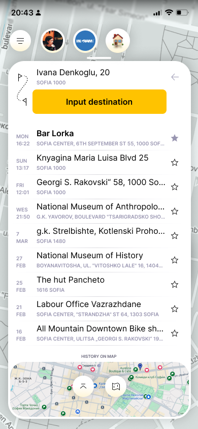
The booking process requires six mandatory steps before the search even begins. While this increases accuracy, it reduces perceived speed. Users lack fast-track paths, and critical options block the main scenario. The absence of predictive defaults, inconsistent control patterns, and suboptimal ergonomics introduce unnecessary friction.
Current TaxiMe booking flow:
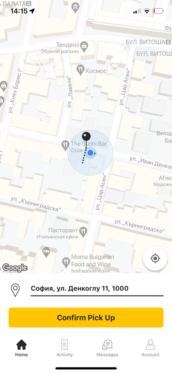
Pickup address,Confirmation →
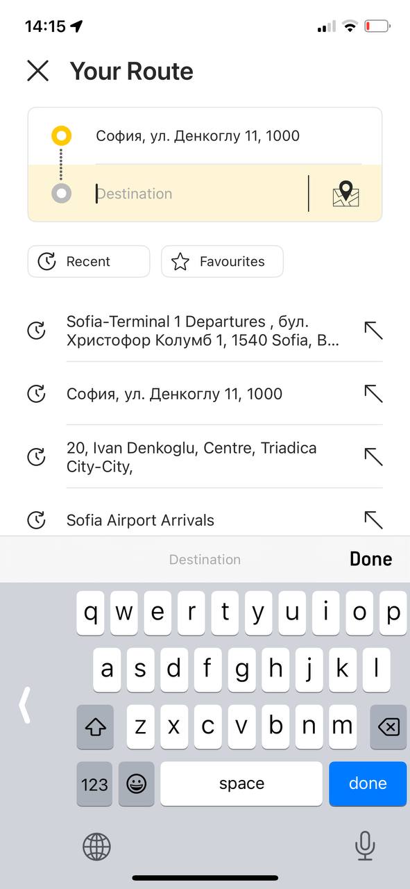
Destination address,Input →
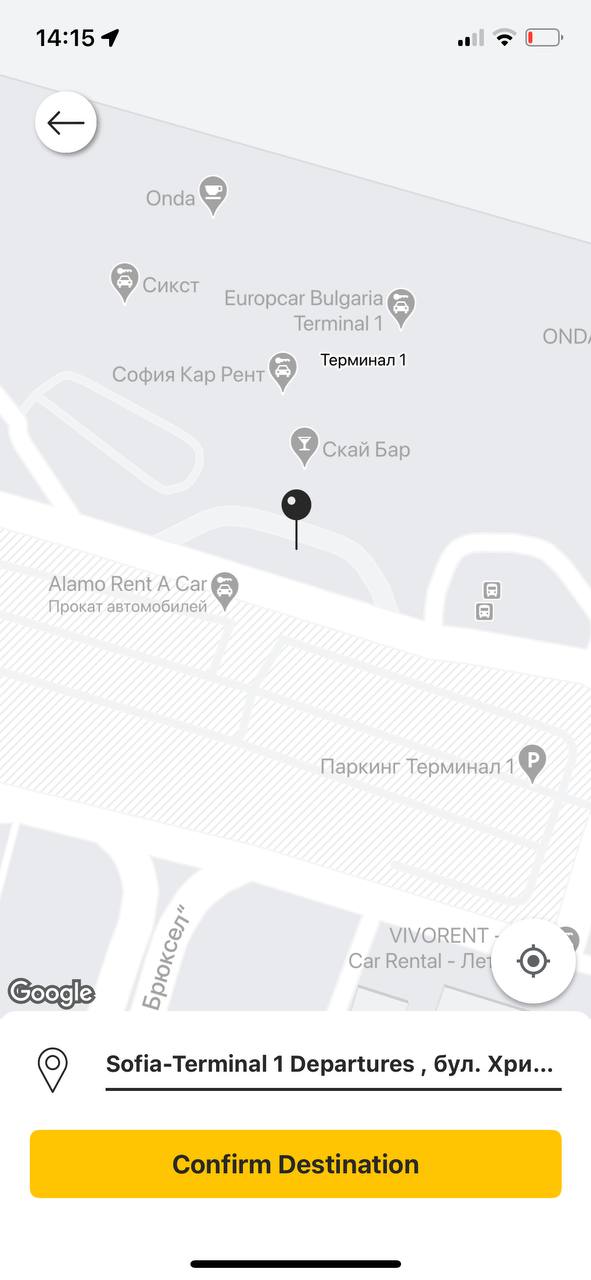
Destination address,Confirmation →

Car class selection,Required →
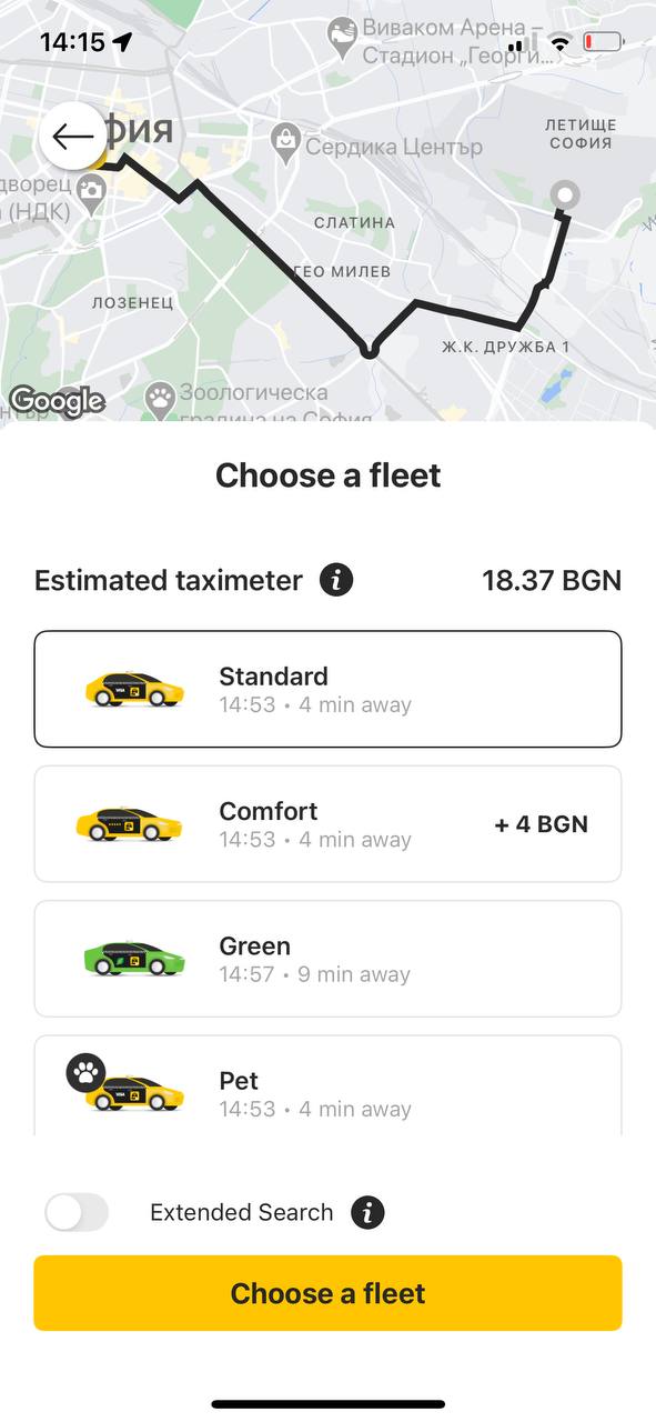
Car class selection,Confirmation →
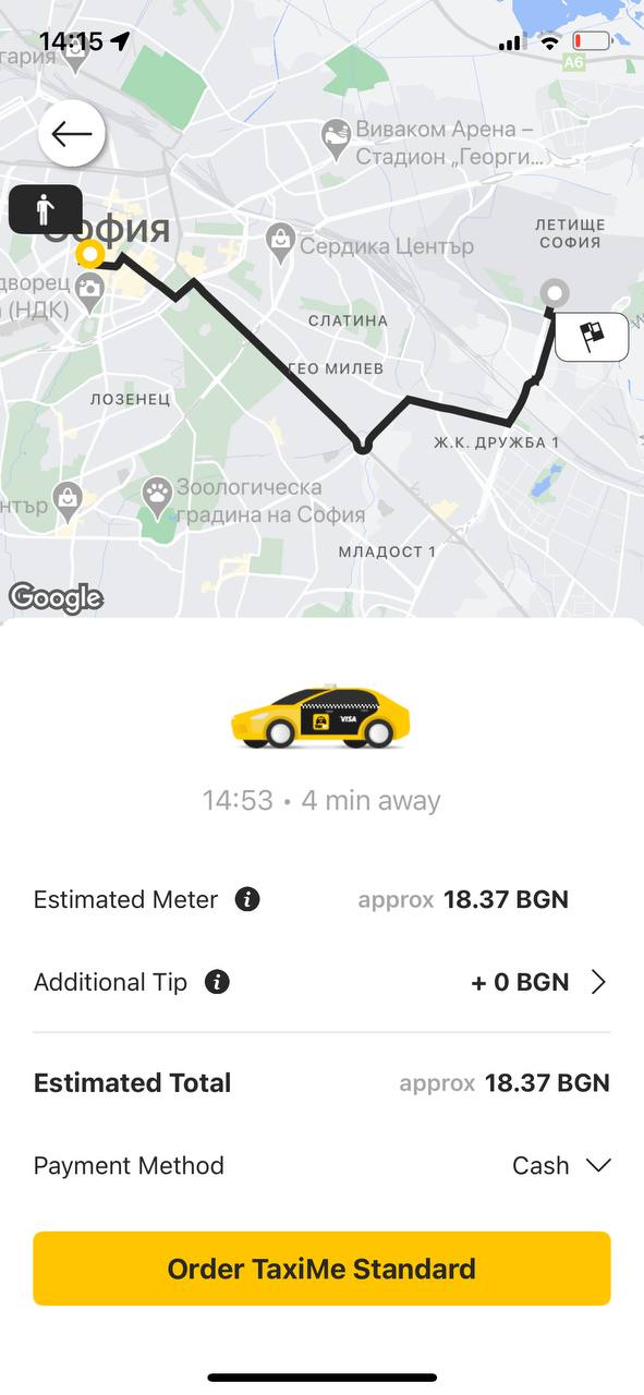
Options selection,Checkout |
Goal
Reduce time-to-order for common scenarios while preserving control for complex ones — leveraging contextual defaults, personalization, and reduced cognitive load.
Optimized Scenarios
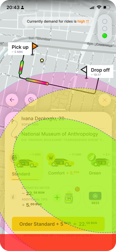
Scenario 1 — New Destination (2–3 steps)
Automatically confirm an accurate pickup point and move all class and option selections to the checkout screen, preserving previous preferences as persistent defaults for subsequent rides.
Pickup address,Confirmation
Entry into 2 scenarios →
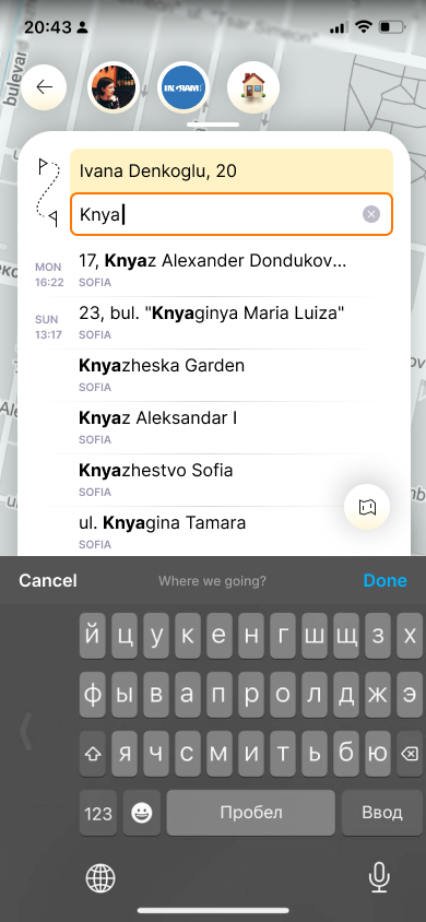
Destination address,Input,Confirmation →
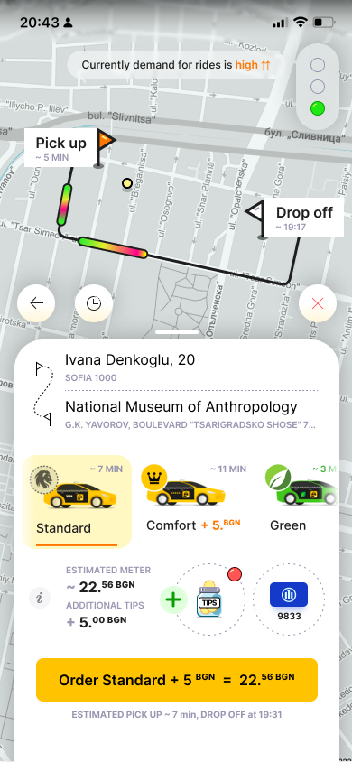
Destination address,Checkout,All options |
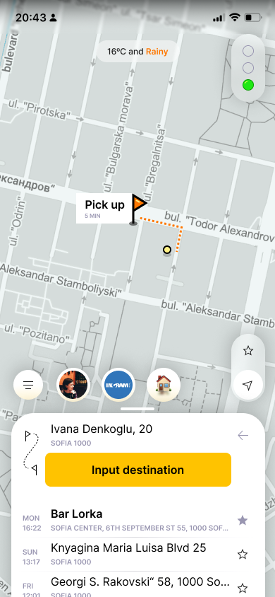
Scenario 2 — Recent / Favorites (1–2 steps)
A swipe-up panel with ride history and frequent destinations on the first screen reduces input for repeat trips. Select destination → checkout.
Pickup address,Confirmation
Entry into 2 scenarios →
Destination address,Selection, Immediate
Confirmation →
Destination address,Checkout,All options |
Scenario 3 — Dynamic Quick Actions (1–2 steps)
Custom preselected addresses (Home–Work–Mall scenario). One tap to checkout.
Pickup address,
Quick access →

Destination address,Checkout |
The taxi fleet is selected based on ride history or defaults to “Standard.” Users can change it without blocking the primary flow.
Car class selection,Required →
Car class selection,Confirmation →
Options selection,Checkout |
Car class
Payment method,Tips
Accessibility and Interface Patterns
Reachability zone
Key CTAs and settings are placed within the lower third of the screen.
Road congestion
Secondary controls
Primary controls
Main CTA
System area
Interface separation
Top — data and mapBottom — controls and actions
Consistency
Unified iconography and visual semantics across all states.High contrast, large hit targets, clear status indicators, voice input support.
Guidelines
- Do not hide inactive elements — disable them with clear explanations.
- Minimize layout shifts between states.
- Apply progressive defaults.
- Ensure ML predictions are explainable.
Load Indicator
A simple demand and availability status displayed near the main CTA.
Smart Scheduled Rides
Auto-trigger search and radius expansion via timed logic.
Weather as Context
Inform users about environmental factors affecting ride fulfillment.
Visual Quick Buttons
Icon- or emoji-based cards to accelerate recognition.
KPI
- Time-to-order ↓ на 30–50%
- Confirmation conversion ↑ на 5–10%
- Cancellations ↓ на 10–20%
- CSAT/NPS ↑
Conclusion
Transitioning to predictive and zero-input scenarios reduces friction and accelerates the flow while preserving user control. Fast paths, contextual defaults, and bottom-first interaction deliver maximum product impact with minimal architectural changes.
© Alexander Zykow, 2026
Next cases AnyTalk →


Taxi CJM Case
TaxiMe, 2025
Introduction
As an active user of ride-hailing products across different countries, I’ve developed a solid understanding of core UX patterns and user expectations in this category. TaxiMe is one of the leading services in Bulgaria: the product is evolving, yet the primary booking flow still contains friction points. This case study proposes optimizing the scenario through predictive UX principles, progressive disclosure, and a bottom-first interaction model.
Current Flow and Pain Points
The booking process requires six mandatory steps before the search even begins. While this increases accuracy, it reduces perceived speed. Users lack fast-track paths, and critical options block the main scenario. The absence of predictive defaults, inconsistent control patterns, and suboptimal ergonomics introduce unnecessary friction.
Current TaxiMe booking flow:
Pickup address,Confirmation →
Destination address,Input →
Destination address,Confirmation →
Car class selection,Required →
Car class selection,Confirmation →
Options selection,Checkout |
Goal
Reduce time-to-order for common scenarios while preserving control for complex ones — leveraging contextual defaults, personalization, and reduced cognitive load.
Optimized Scenarios
Scenario 1 — New Destination (2–3 steps)
Automatically confirm an accurate pickup point and move all class and option selections to the checkout screen, preserving previous preferences as persistent defaults for subsequent rides.
Pickup address,Confirmation
Entry into 2 scenarios →
Destination address,Input,Confirmation →
Destination address,Checkout,All options |
Scenario 2 — Recent / Favorites (1–2 steps)
A swipe-up panel with ride history and frequent destinations on the first screen reduces input for repeat trips. Select destination → checkout.
Pickup address,Confirmation
Entry into 2 scenarios →
Destination address,Selection, Immediate
Confirmation →
Destination address,Checkout,All options |
Scenario 3 — Dynamic Quick Actions (1–2 steps)
Custom preselected addresses (Home–Work–Mall scenario). One tap to checkout.
Pickup address,
Quick access →
Destination address,Checkout |
The taxi fleet is selected based on ride history or defaults to “Standard.” Users can change it without blocking the primary flow.
Car class selection,Required →
Car class selection,Confirmation →
Options selection,Checkout |
Car class
Payment method,Tips
Accessibility and Interface Patterns
Reachability zone
Key CTAs and settings are placed within the lower third of the screen.
Road congestion
Secondary controls
Primary controls
Main CTA
System area
Interface separation
Top — data and mapBottom — controls and actions
Consistency
Unified iconography and visual semantics across all states.High contrast, large hit targets, clear status indicators, voice input support.
Guidelines
- Do not hide inactive elements — disable them with clear explanations.
- Minimize layout shifts between states.
- Apply progressive defaults.
- Ensure ML predictions are explainable.
Load Indicator
A simple demand and availability status displayed near the main CTA.
Smart Scheduled Rides
Auto-trigger search and radius expansion via timed logic.
Weather as Context
Inform users about environmental factors affecting ride fulfillment.
Visual Quick Buttons
Icon- or emoji-based cards to accelerate recognition.
KPI
- Time-to-order ↓ на 30–50%
- Confirmation conversion ↑ на 5–10%
- Cancellations ↓ на 10–20%
- CSAT/NPS ↑
Conclusion
Transitioning to predictive and zero-input scenarios reduces friction and accelerates the flow while preserving user control. Fast paths, contextual defaults, and bottom-first interaction deliver maximum product impact with minimal architectural changes.
© Alexander Zykow, 2026
Next case AnyTalk →
Taxi CJM Case
TaxiMe, 2025
Introduction
As an active user of ride-hailing products across different countries, I’ve developed a solid understanding of core UX patterns and user expectations in this category. TaxiMe is one of the leading services in Bulgaria: the product is evolving, yet the primary booking flow still contains friction points. This case study proposes optimizing the scenario through predictive UX principles, progressive disclosure, and a bottom-first interaction model.
Current Flow and Pain Points
The booking process requires six mandatory steps before the search even begins. While this increases accuracy, it reduces perceived speed. Users lack fast-track paths, and critical options block the main scenario. The absence of predictive defaults, inconsistent control patterns, and suboptimal ergonomics introduce unnecessary friction.
Current TaxiMe booking flow:
Pickup address,Confirmation →
Destination address,Input →
Destination address,Confirmation →
Car class selection,Required →
Car class selection,Confirmation →
Options selection,Checkout |
Goal
Reduce time-to-order for common scenarios while preserving control for complex ones — leveraging contextual defaults, personalization, and reduced cognitive load.
Optimized Scenarios
Scenario 1 — New Destination (2–3 steps)
Automatically confirm an accurate pickup point and move all class and option selections to the checkout screen, preserving previous preferences as persistent defaults for subsequent rides.
Pickup address,Confirmation
Entry into 2 scenarios →
Destination address,Input,Confirmation →
Destination address,Checkout,All options |
Scenario 2 — Recent / Favorites (1–2 steps)
A swipe-up panel with ride history and frequent destinations on the first screen reduces input for repeat trips. Select destination → checkout.
Pickup address,Confirmation
Entry into 2 scenarios →
Destination address,Selection, Immediate
Confirmation →
Destination address,Checkout,All options |
Scenario 3 — Dynamic Quick Actions (1–2 steps)
Custom preselected addresses (Home–Work–Mall scenario). One tap to checkout.
Pickup address,
Quick access →
Destination address,Checkout |
The taxi fleet is selected based on ride history or defaults to “Standard.” Users can change it without blocking the primary flow.
Car class selection,Required →
Car class selection,Confirmation →
Options selection,Checkout |
Car class
Payment method,Tips
Accessibility and Interface Patterns
Reachability zone
Key CTAs and settings are placed within the lower third of the screen.
Road congestion
Secondary controls
Primary controls
Main CTA
System area
Interface separation
Top — data and mapBottom — controls and actions
Consistency
Unified iconography and visual semantics across all states.High contrast, large hit targets, clear status indicators, voice input support.
Guidelines
- Do not hide inactive elements — disable them with clear explanations.
- Minimize layout shifts between states.
- Apply progressive defaults.
- Ensure ML predictions are explainable.
Load Indicator
A simple demand and availability status displayed near the main CTA.
Smart Scheduled Rides
Auto-trigger search and radius expansion via timed logic.
Weather as Context
Inform users about environmental factors affecting ride fulfillment.
Visual Quick Buttons
Icon- or emoji-based cards to accelerate recognition.
KPI
- Time-to-order ↓ на 30–50%
- Confirmation conversion ↑ на 5–10%
- Cancellations ↓ на 10–20%
- CSAT/NPS ↑
Conclusion
Transitioning to predictive and zero-input scenarios reduces friction and accelerates the flow while preserving user control. Fast paths, contextual defaults, and bottom-first interaction deliver maximum product impact with minimal architectural changes.
© Alexander Zykow, 2026
Next Case AnyTalk →